Quick Summary
Generals International came to us for a complete online relaunch, and I worked with their in-house team and my own contractor to create an updated brand and custom website tailored for their smaller media team.
The Backstory
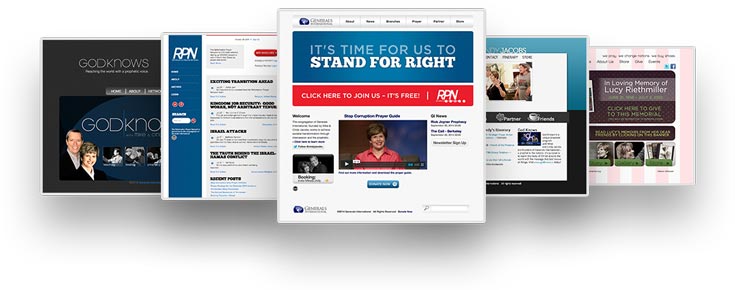
Before launching Craft+Story, I worked for six and a half years as the Web Director for Generals International. I was lucky to have a great team that set a high bar for running and updating multiple websites on a budget. In the past few years, though, the original team was down to one person, and the network of sites was too much to maintain. The main site (www.generals.org) dropped in traffic and user engagement, and the other sites split traffic and diluted the brand.
Last year, my best friend, Daniel Jacobs, came back to take over the communications department and asked me to help them get their numbers back to where they were and build a new platform that could be run by a small team of media, graphics, and web people.
The Problem
Generals had 5–6 sites getting 10% of the traffic the main site had been getting years ago (which obviously affected partnerships and sales as well), and they needed everything to be run by a media team with only one full-time graphics/web person. On top of that, none of the sites were optimized for the 40% of mobile visitors that GI was getting. Daniel and I set four goals going into the relaunch:
- Build a system that could be maintained (and even grown) by a single web/graphics person with some added help from media and content specialists
- Rebuild generals.org to be the mobile-friendly and content-focused hub for everything related to GI, Mike and Cindy Jacobs, and the Reformation Prayer Network (eliminating all sites but the main one)
- Increase engagement and partnership from current members of their primary audience
- Bring new visitors to the website from outside GI’s circle and engage them in what Generals is doing
Our Solution
Updated Brand
The GI brand has been around in one way or another for almost 30 years. We didn’t want to lose all of that history (or alienate their current base), but we needed to update some of the dated elements and unify it across the website, videos, print materials, and other random outlets. I worked with GI’s in-house designer at the time, Adam Palmer, to craft an updated brand for everything Generals. While he worked on evolving the logo, I developed a system of type, color, and graphic elements that would appeal to a new generation across all mediums without alienating all those who’ve supported them until now.
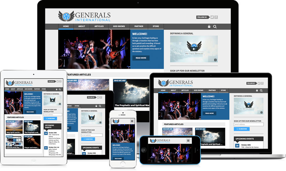
New Responsive Website Design
We wanted to redesign the site to use their new brand colors and type, but more importantly we needed to start doing more to cater to the 40% of visits they were getting from mobile devices (tablets and phones). For the most future-proof solution, we designed and developed a system of responsive website elements and templates for their CMS that can adapt and look great on any screen size without having to worry about complex device detection or extra design work from their in-house team. Not only does the main page change layout based on screen sizes, but each of the custom elements like banners and video players are built to use an optimal layout for each screen.
CMS Integration and Customization
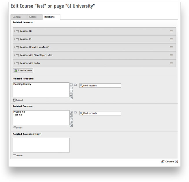
Most of our effort was spent on tailoring the CMS (TYPO3) and building custom plugins so that not only could one person run the site, but they could include new functionality and advanced features without more work on their part. I worked with Daniel and their team to design the best content workflows and systems, and then we built out existing systems (like frontend users and news handling) to match their processes. For some of the more complex needs, including a courseware system and a multilingual donation plugin with hooks into their CRM (Neon CRM), we created custom TYPO3 extensions using all the standard practices to make sure that any future developers (not just us) could extend them in the future.
Multilingual Everything
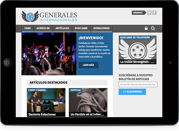
Can we really call it an international ministry if the site can only speak English? More importantly, how do we best serve the international audience that’s already engaged and watching GI productions across the non-English speaking world? We setup the website and all of the custom plugins to accept standard translation files and even serve the correct language by default based on browser settings (with easy menu buttons to change your default language). We built and tested everything with Spanish (GI’s largest market after English), but we’re excited to see it translated to Arabic, Chinese, and any number of languages in the future.
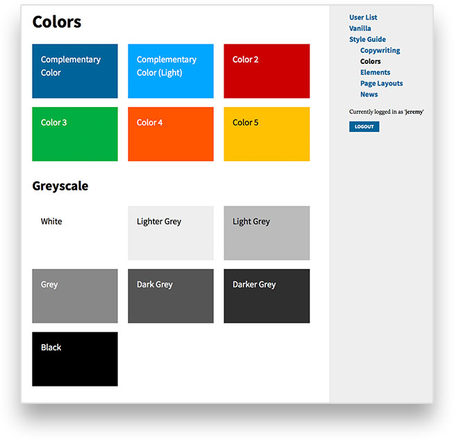
Integrated Style Guides
I believe that a good handoff must include all the tools necessary to continue evolving the brand and website long after we’ve launched, but that’s often done through a set of static documents separate from the CMS that work better in larger teams where people are in charge of maintaining and enforcing them. Instead of static files, we integrated all of the visual and copywriting style guides and example elements into a special admin section in the CMS itself. Not only can they take charge of updating and maintaining the guides as the ministry evolves over time, they can copy and paste elements straight from the examples as they build new pages.
The Outcome
Before we even launched, Daniel and his team were excited about the new “turn-key” system that allowed them to jump in and start doing what was most needed — creating content. The staff of GI loves the new brand and site, and it’s been a hit with their current partners and donors. We wanted to see some immediate results that can be good indicators of future performance after a couple weeks, and these were some of the numbers that showed we had already reached some immediate goals of more engaged users across all devices:
- Website users were up 166.26% (67.5% of which were new visitors)
- Mobile visits were up 283.63%
- Session duration was up 42.73% to 2:47
The Wrap-Up
As far as reach, scope, and value, this was our most ambitious project to date by far. In total, it took five months of dedicated time and another five months of consulting to launch everything, and we’re still working on some things. We learned a few things through trial and error, but I’m glad to see the success of the new site.
Related Projects
Want to see what we could do for you? Tell us what you need!